Once upon a time, there was this anthology...
By way of introduction: I thought a bit of a look behind the tablet into the HBVB logo design process could be interesting to a sick, perverted few of you.
There’re years, nay decades of unwitting preparatory work that led to the project finally blinking into existence, and this occasional series will help pad out the calls to action and shameless reblogs and get us over the Festive hump intact.

The logo that adorns the book, our tees, prints and all the other synapse-snapping collateral you see here (and all over your Facebook and Twitter feeds, ahem) has been bubbling away in my subconscious since I first daubed a rickety looking Judas Priest logo on a pencil case somewhere around Year Eight.
Scratching meticulous, geometrically (and occasionally typographically) complex logos in biro, on vinyl what’s more, clearly locked the ol’ career path to ‘anal retentive self flagellation’ long before I discovered the totality of my options were Medicine, Law or Apprentice Boilermaker.
These tees then, some of which I may have owned in one lurid form or another, represent my nascent exposure to graphic design, and locked blackletter forms deep in a vault somewhere: eternally Evil and Bad Arse, a jigsaw of swooping, predatory forms begging to be solved.
(I would later discover, through thorough research, that a lot of beer labels and logos embrace the style, funnily enough.)

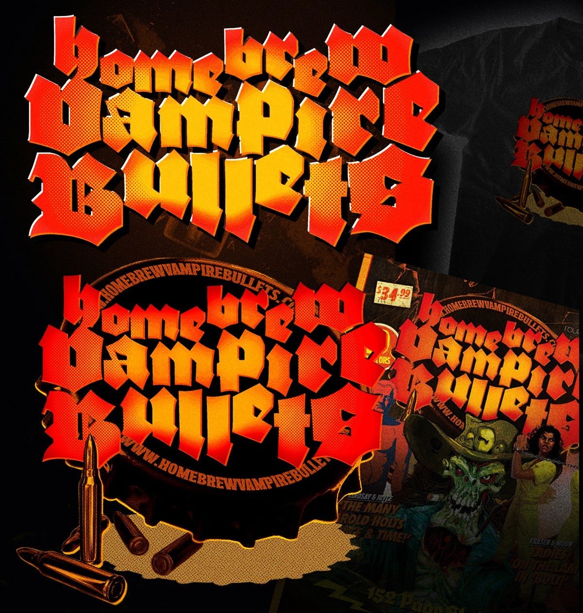
“Home Brewed Vampire Bullets, by John Hill”
Vaguely hungover, digging through a stack of second (fifth? Ninth?) hand magazines somewhere on Smith St., Collingwood, this masterpiece of saturated early seventies design smut punches through.
It’s out of a ’sporting’ shooting magazine, something about juicing up your ordnance through no doubt rock solid chemistry to exact maximum carnage on the veldt.
Sadly, I neglected to buy it, but did take a quick, blurry snap.
Just in case.
The article title stuck, rolled around the cranium for a bit.
Same for the imagery- that burnished, blast furnace sepia and ochre’s always lived in my palette, strangely enough.
I’ll spare you the early excursions and explorations of the disco meets stick flick via Rainbow look that initiated the process, but suffice it to say things took a turn for the inevitably Gothic.
I never rated that calligraphic, Biblically inspired (ironies lost for a while yet) logo Judas Priest used into the late ’70s. Too much like the stuff me mum painstakingly rendered via tracing paper onto Philharmonic posters, perhaps?
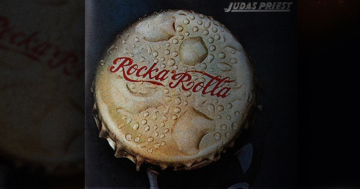
Those two albums, Sin After Sin and Rocka Rolla (the reissue, pictured, by Melvyn Grant, fantasy artist) did use blackletter in their title treatments, and I very much locked that shit away and unconsciously explored it down the years.

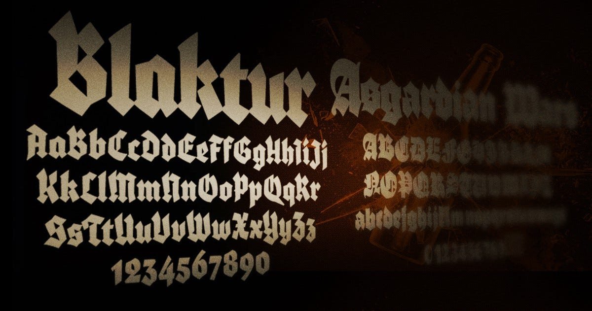
With overall concept starting to coalesce, and having the luxury of the internet, I set out to unearth a blackletter that wasn’t a Flyerfont or an LHF offering.
Even in these heady days of Top 50 Metal Fonts and semi-defunct Angelfire sites laden with poorly constructed knock offs of band logos, this proved more of a chore than initially expected.
A chore, that is, if you consider venturing further and further into the Type-Nerd Narnia a taxing endeavour.
Eventually Blaktur and Asgardian Wars (yes indeed) picked themselves out as our faces of choice: a combination of the two made most sense, as Asgardian Wars’ punctuation and numeral forms were less than suitable (practically non existent).
I’ll leave you to provide your own Norse mythology/ typography related pun right here.
Next up? Figuring out how to get the bastards to sing.
Cue the usual scattershot landscape of upper and lower case forms.

A jigsaw with no solution, just the knowledge that you’ll know when it feels ’right’ via some nonsense equation of negative shapes, X and Y heights and some blind luck.
By which I mean talent, of course.
Let’s pause here to acknowledge that every single time you see a yellow-red linear gradient in my work, it’s because of Barbarian.

With the overall look locked down, I, of course, succumbed to some extreme design overkill (I design DVDs by day, aright?)- bullet holes, blood, all the paper textures on the hard drive, all that good stuff.


A combination of factors, thankfully, intervened:
1. The eye bleeding busy-ness of any potential cover with that kitchen sink included logo was not an ideal outcome
2. We wanted to sell some promotional tees and the screen printers limited us to ten blessed, very reasonable colours
(Home brew vampire) bullet dodged (ho ho): I limited the palette, worked in my ‘signature’ gradient and had a punchy, None More Metal logo on my hands.
We’re in business: now to refine.
Here’s where a bit of that Judas Priest foreshadowing pays off.
The original cover to their debut album featured this John Pasche bottle cap design, which was apparently intended for a Stones album (Pasche designed their ‘tongue’ logo, for starters).
Initially knocked together as a tee shirt design (see aforementioned foreshadowing), as the piece developed it was clear the overall effort was mighty, iconic and encapsulated the HBVB ideal rather succinctly.
Sorted: the logo was applied to ZERO in its simplified form, retaining its distinctiveness and proving its worth in a variety of applications.
We’ll call that a lock, then.
All of the above took, varyingly, the better part of twenty years to parse and synthesise, and a month or so to finally nail down.
That’s it for now.