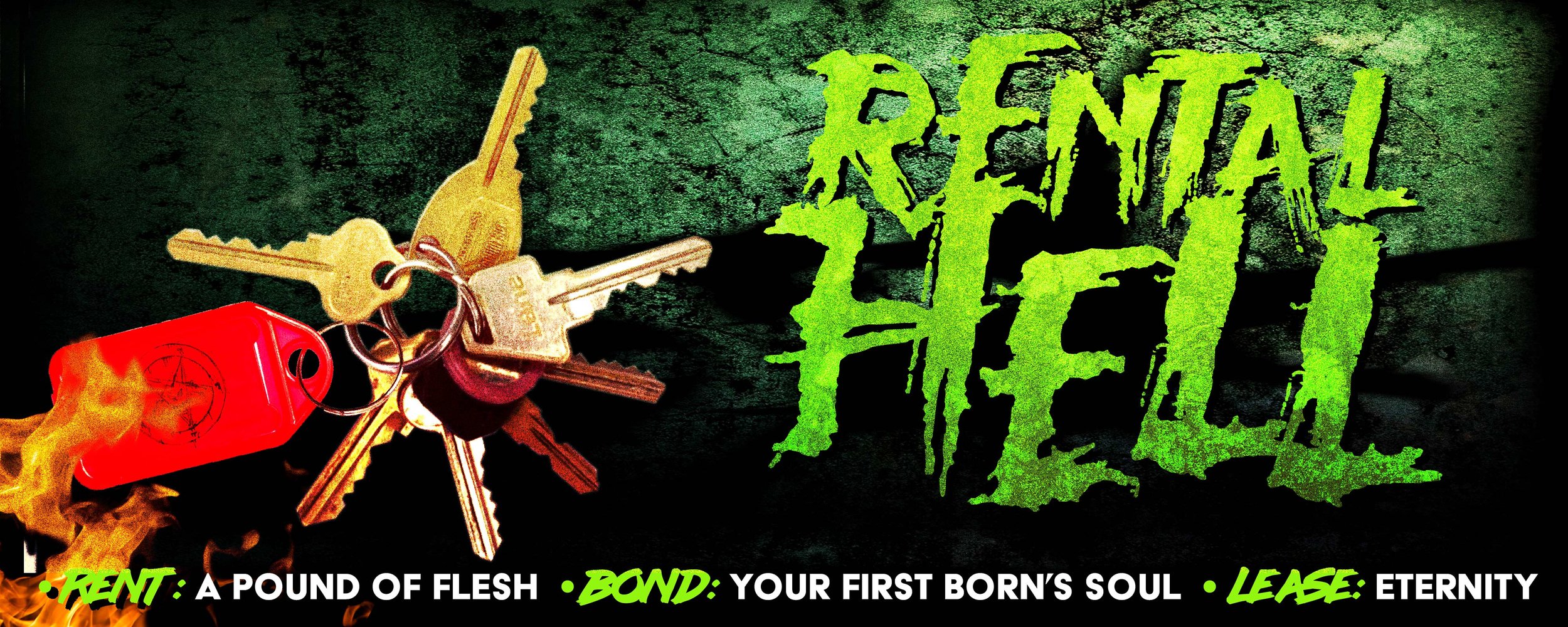
PREVIEW: RENTAL HELL by Garth Jones

Here’s an excerpt of the edited version of a piece I submitted to the West Australian’s “Best Aussie Yarn” (sic).

Turns out they’re not into downer yarns set in the here and now, nor have they been renters in the last, ah, quarter century or so.

Who’d have thunk.

Anyhoot – there’s a longer form version of this that I have plans for, but please accept this one as a taste of my recent lit-comp alienating stylings for the time being.

(Thanks especial to Steve MinOn for suggesting the edits that squeaked this one in under the word count, too).

You can read the full version in BLACK PILLS: 7 TALES TO ASTONISH & CONFOUND, out now!

THERE had been many disappointments in the DeRoche’s recent rear view, and this catastrophic pile, this hazardous sore, barely a shelter – the sole rental in their budget and within walking distance of a kindy – was the final kick in the guts, confirming the universe held them in considerable disdain. 

Reggie, stoic: “Kudos to the Photoshop guy, they really earned their effing keep, eh babe?” 

Tobey, succinct: “What an effing shit hole.”

Amity, nearly-five: “Does it have an effing kitty door for a meow?”

Reggie sucked air between her teeth, giving Tobes a look.

“Better apply, right, babe? Lucky thirty-seven?”

Tobes just nodded.

*

“Is that… human faeces?” Reggie gasped.

Property Manager Nickala Grezzdl made a note to get back to the bond cleaners…

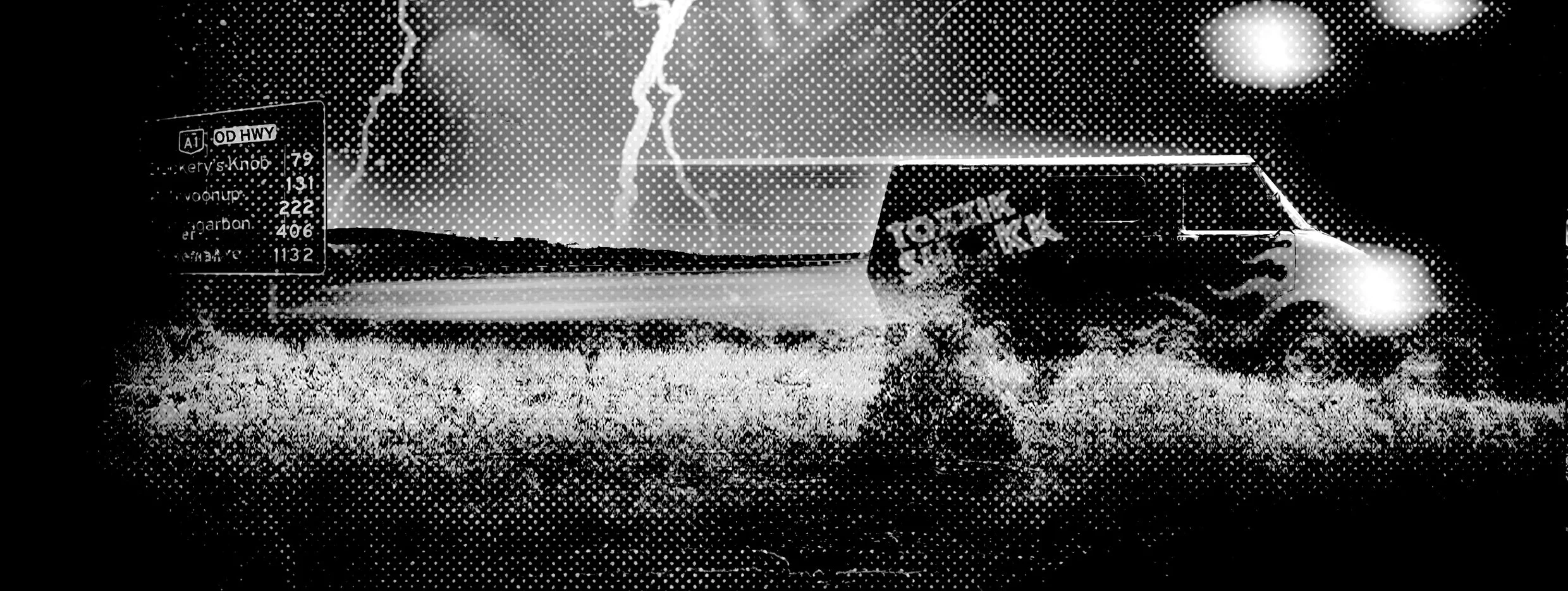
THE PUB WITH NO BLOKES - short fiction by Garth Jones

“– Revenant had supped of the Shaman’s elixirs
Yet still its condition was rabid dire
Returned as it did from Wasteland to Bolthole
A journey marked by shit and eldritch fi-iy-yire

Upon the coach trail, the path to Salvation
A portal did open, in the fabric of Real
Beyond that glimmering shroud, strange parallel Nation
A table was set, in house of Libation
Now The Revenant’s Ally, unlikely, the Bard –”

“Hmmm. Yeah, right-o. Nup, fuck that.”

Belching rotten cabbage, Ed Von Satán put the Witchfingerer tape out of its misery.

The undead pub rocker, cresting fifty going on 27 eternal, had been just off the Overdimensional track back into Wangkur when the agonies struck hard.

He was grinding away at a GrintCo Servo Bic, trying to get a lung buster lit, when a phantom vice grabbed his entire large intestine and gave it a hefty twist. Shock had Ed stomping on the accelerator as his good eye momentarily blurred wet. The old Bedford lurched into a scrubby verge, pinging a succession of lane markers. Ed hauled his foot off the gun as alien torment fisted its way southerly.

The van settled in a spume of red dust, which hung sort of hypnotically in the blazing Western Arcadian sunset.

Ed hadn’t noticed anything particularly lyrical about his sitch.

He shouldered the cabin door open, then carefully slid out of the cockpit, the fiery prolapse marching into his sphincter sharpening him.

Ed, mate, his surprisingly calm inner monologue rasped. About those five out-of-date Chiko Rolls and the slab of Four X you knocked off with Ron after he’d serviced the –
The thought was cut off by a turtle’s head touching rarely-laundered cheetah-print bikini brief.
That sharpened Ed even further – he snapped left: fuck all but bush, then right: wouldn’t you bloody know it, long-drop salvation.

He unbuckled and dropped, waddle-shuffling up to the structure. Hot pink

DANGER DO NOT ENTER DANGER DO NOT ENTER DANGER DO NOT ENTER DANGER DO NOT ENTER DANGER DO NOT ENTER DANGER DO NOT ENTER DANGER DO NOT ENTER DANGER DO NOT ENTER DANGER DO NOT ENTER DANGER DO NOT ENTER DANGER DO NOT ENTER DANGER DO NOT ENTER

Read the full story in Yarns From the Fuck-You-Ni-Verse.

HOME BREWED REVIEW – DUVAY KNOX (THE PUSSY DETECTIVE) by Garth Jones

☆☆☆☆☆

“Gonzo meets Grunge=GRONZO is this new form dat GARTH JONES has laid out. Debauchery and Demonic Entities reminds me if STANLEY KUBRICK had flipped his moovie EYES WIDE SHUT on its head and wrote THIS joint. Loved the Aussie SLANG and how Garth SLUNG werds round on the page so u was constantly off guard wit wut SICKNESS was cumming next. This book in many ways is social commentary on the world of ENTERTAINMENT & HOLLYWOOD in general. In shawt: peeps are willing to do ANYTHANG for 15 minutes of FAME FUCKERY. Even if it means KONTROLLING and DEMOLISHING a whole crowd of folks. The book format is decidely non-linear (and dats a GOOD thang). Especially, if U R tired of reading da same old formatted shit. U kinda hafta 2 B TAPPED into da ZEITGEIST of pop kulture to undastand SUM thangs. Butt dats good. WAKE YA ASS UP and kno wuts going on round ya!! GARTH delivers. Im glad he wrote this. Cuz its a book U kan open up to any page and it POPS and FUCKS UP ya Sensibilities and Expectations. Git to kno Garth cuz I think HIS is da VOICE of a new kinda Writing.”

Read Duvay.

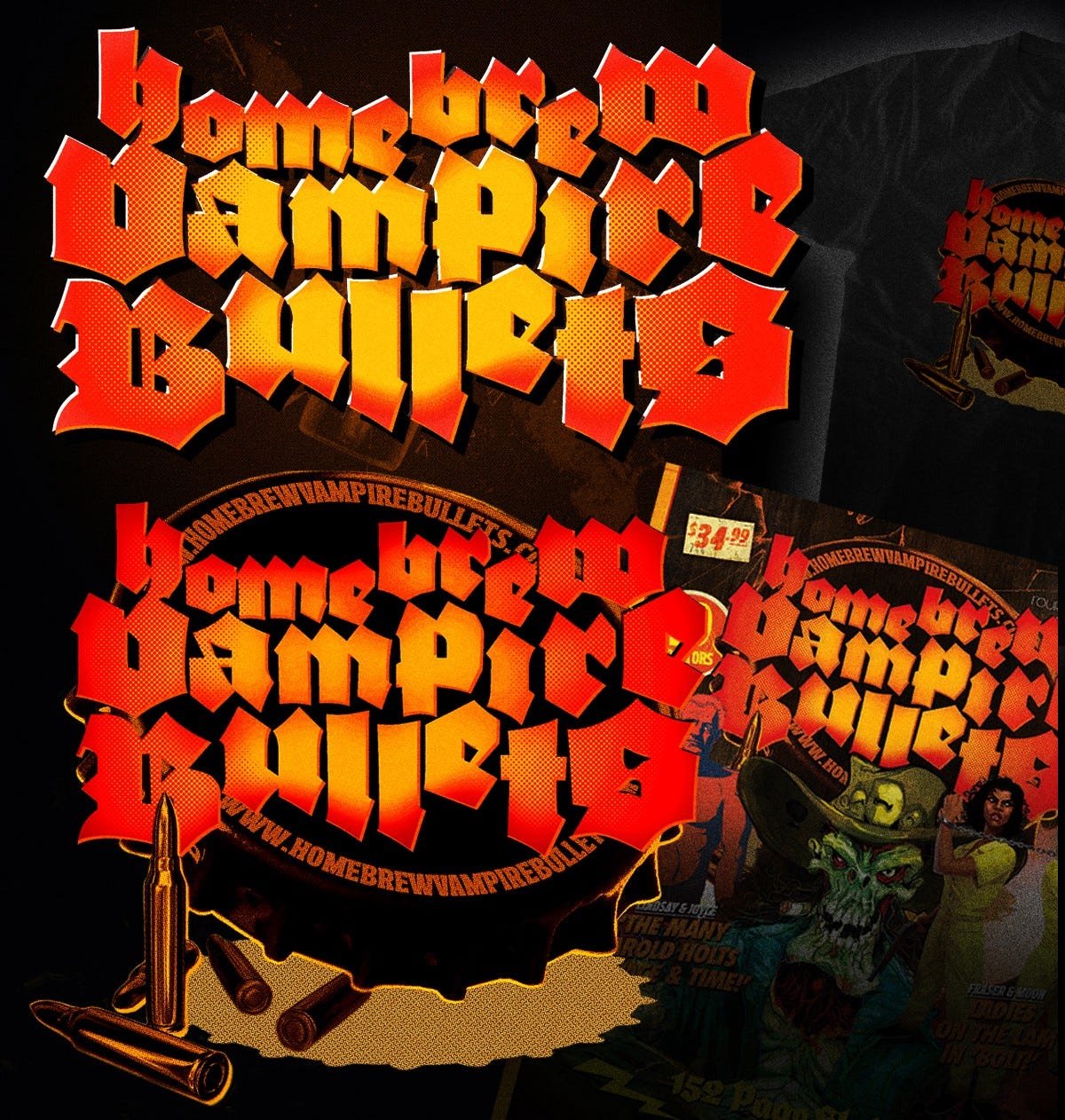
from the archives: A brief evolutionary insight into the (original) HBVB Logo (2014) by Garth Jones

Once upon a time, there was this anthology...

By way of introduction: I thought a bit of a look behind the tablet into the HBVB logo design process could be interesting to a sick, perverted few of you.

There’re years, nay decades of unwitting preparatory work that led to the project finally blinking into existence, and this occasional series will help pad out the calls to action and shameless reblogs and get us over the Festive hump intact.

The logo that adorns the book, our tees, prints and all the other synapse-snapping collateral you see here (and all over your Facebook and Twitter feeds, ahem) has been bubbling away in my subconscious since I first daubed a rickety looking Judas Priest logo on a pencil case somewhere around Year Eight.

Scratching meticulous, geometrically (and occasionally typographically) complex logos in biro, on vinyl what’s more, clearly locked the ol’ career path to ‘anal retentive self flagellation’ long before I discovered the totality of my options were Medicine, Law or Apprentice Boilermaker.

These tees then, some of which I may have owned in one lurid form or another, represent my nascent exposure to graphic design, and locked blackletter forms deep in a vault somewhere: eternally Evil and Bad Arse, a jigsaw of swooping, predatory forms begging to be solved.

(I would later discover, through thorough research, that a lot of beer labels and logos embrace the style, funnily enough.)

“Home Brewed Vampire Bullets, by John Hill”

Vaguely hungover, digging through a stack of second (fifth? Ninth?) hand magazines somewhere on Smith St., Collingwood, this masterpiece of saturated early seventies design smut punches through.

It’s out of a ’sporting’ shooting magazine, something about juicing up your ordnance through no doubt rock solid chemistry to exact maximum carnage on the veldt.

Sadly, I neglected to buy it, but did take a quick, blurry snap.

Just in case.

The article title stuck, rolled around the cranium for a bit.

Same for the imagery- that burnished, blast furnace sepia and ochre’s always lived in my palette, strangely enough.

I’ll spare you the early excursions and explorations of the disco meets stick flick via Rainbow look that initiated the process, but suffice it to say things took a turn for the inevitably Gothic.

I never rated that calligraphic, Biblically inspired (ironies lost for a while yet) logo Judas Priest used into the late ’70s. Too much like the stuff me mum painstakingly rendered via tracing paper onto Philharmonic posters, perhaps?

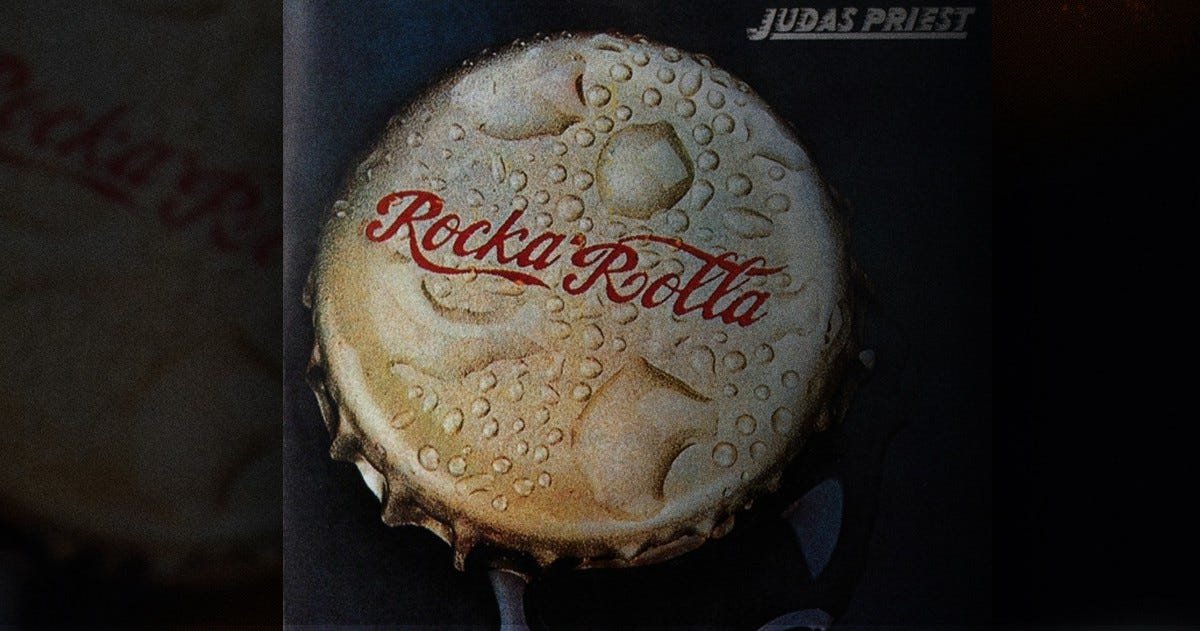
Those two albums, Sin After Sin and Rocka Rolla (the reissue, pictured, by Melvyn Grant, fantasy artist) did use blackletter in their title treatments, and I very much locked that shit away and unconsciously explored it down the years.

With overall concept starting to coalesce, and having the luxury of the internet, I set out to unearth a blackletter that wasn’t a Flyerfont or an LHF offering.

Even in these heady days of Top 50 Metal Fonts and semi-defunct Angelfire sites laden with poorly constructed knock offs of band logos, this proved more of a chore than initially expected.

A chore, that is, if you consider venturing further and further into the Type-Nerd Narnia a taxing endeavour.

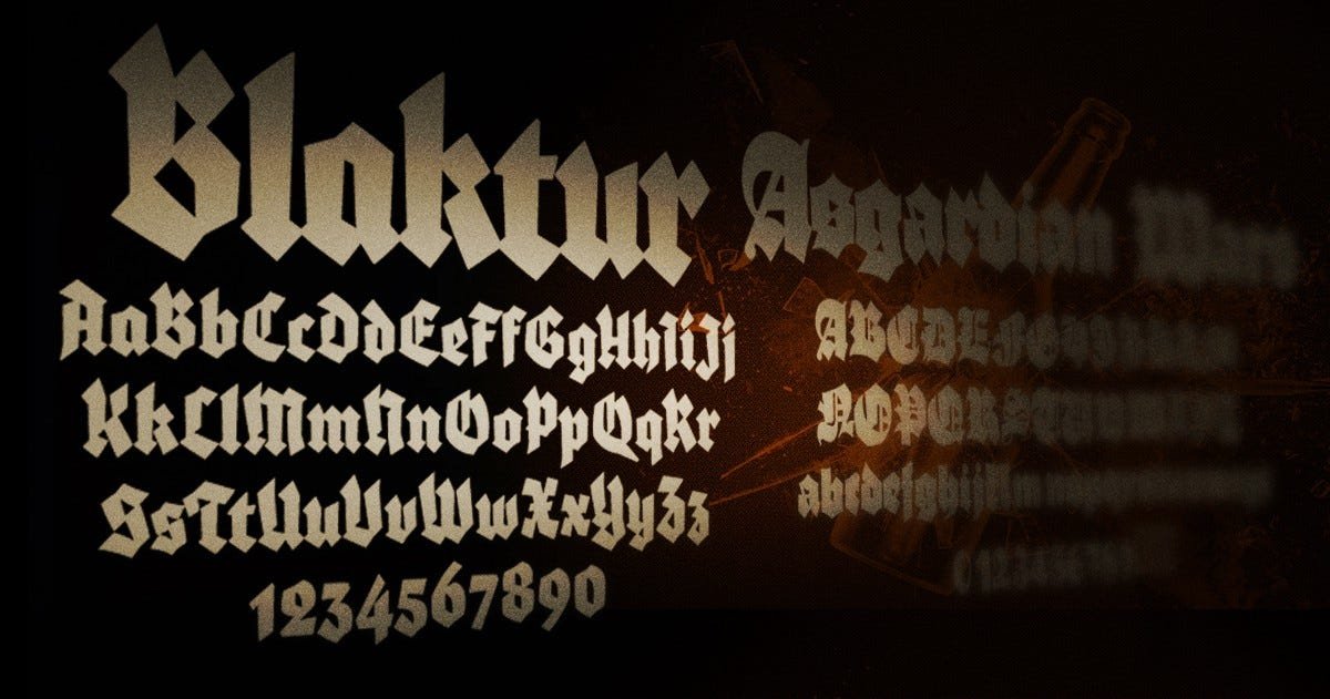
Eventually Blaktur and Asgardian Wars (yes indeed) picked themselves out as our faces of choice: a combination of the two made most sense, as Asgardian Wars’ punctuation and numeral forms were less than suitable (practically non existent).

I’ll leave you to provide your own Norse mythology/ typography related pun right here.

Next up? Figuring out how to get the bastards to sing.

Cue the usual scattershot landscape of upper and lower case forms.

A jigsaw with no solution, just the knowledge that you’ll know when it feels ’right’ via some nonsense equation of negative shapes, X and Y heights and some blind luck.

By which I mean talent, of course.

Let’s pause here to acknowledge that every single time you see a yellow-red linear gradient in my work, it’s because of Barbarian.

With the overall look locked down, I, of course, succumbed to some extreme design overkill (I design DVDs by day, aright?)- bullet holes, blood, all the paper textures on the hard drive, all that good stuff.

A combination of factors, thankfully, intervened:

1. The eye bleeding busy-ness of any potential cover with that kitchen sink included logo was not an ideal outcome

2. We wanted to sell some promotional tees and the screen printers limited us to ten blessed, very reasonable colours

(Home brew vampire) bullet dodged (ho ho): I limited the palette, worked in my ‘signature’ gradient and had a punchy, None More Metal logo on my hands.

We’re in business: now to refine.

Here’s where a bit of that Judas Priest foreshadowing pays off.

The original cover to their debut album featured this John Pasche bottle cap design, which was apparently intended for a Stones album (Pasche designed their ‘tongue’ logo, for starters).

Initially knocked together as a tee shirt design (see aforementioned foreshadowing), as the piece developed it was clear the overall effort was mighty, iconic and encapsulated the HBVB ideal rather succinctly.

Sorted: the logo was applied to ZERO in its simplified form, retaining its distinctiveness and proving its worth in a variety of applications.

We’ll call that a lock, then.

All of the above took, varyingly, the better part of twenty years to parse and synthesise, and a month or so to finally nail down.

That’s it for now.

from the archives: into fashion (2004) by Garth Jones

Why are vampires such ponces?

This is what vexes Jack Crow.

Alpha bastard protagonist of the unremittingly awful John Carpenter’s Vampires, Jack is an disturbingly ardent commentator when it comes to the vampire rag trade.

Yep, when he’s not sucker punching the ladies or swapping smouldering homoerotic glares with the sweatiest Baldwin (Daniel), Jack, Vatican Vampire Slayer and Misogynist Extraordinaire, plays second rate (if there could feasibly be such a thing) Kyle Sandilands to a procession of disturbingly attired plasma quaffers.

Which is a hoot, really, considering Jack appears to be in possession of the second last pair of elastic waisted acid wash jeans in existence (more on that soon).

Not to mention his man-crush, greasy lard bucket Dan, who sports a saucy nehru vest/ prodigous chest carpet combo.

Long before Jack’s fanged nemesis Valek (see ‘V’, Vampire Central Casting Guide, 1998) scrambled from ‘neath some unconsecrated bog, naff, style challenged creatures of the night proliferated.

Cinematically speaking, first out of the cemetery gate was Nosferatu’s nattily attired rat-pire take on the Fu Manchu fingernails with topcoat look.

Sadly, Bela Lugosi, next cab off the Dracula rank, proved far more influential, being the progenitor of the the ludicrous tic (a quizzically arched eyebrow, nigh on seventy years before a certain Mr Dwayne Johnson), poncy cape flourish and excessive pomade abuse.

This ‘dapper exsanguinator’ look stuck, unfortunately.

For decades, the coiff was the only facet of the vamp look open to interpretation. Christopher Lee added a spot of distinguished grey temple action to the mix; and even Blacula managed only a mini-fro and handlebar variation.

Then, along skulks Anne bloody (see that?) Rice, who inflicts contemporary vampire with a penchant for bouncy Pantened bobs and flouncing about aristocratically in frilly shirts.

Madam Rice, Queen of Pain, engineered a disturbing trend- and not just the brooding, ‘woe is me’ introspection of those ‘damned to the eternal midnight’ bollocks. Guffawing archly in the face of hairdressers’ livelihoods the world over, Rice unveiled the flaxen-locked Ritchie Blackmore variation; hair weaves were now de rigeur for the more follicularly challenged amongst the nightcrawler set.

Thus was born a bold, cranky new era in vampire style.

Where once a slicked back barnet would suffice, the undead were now free to indulge in an entirely new universe of tacky hairstyling options: enter the spiky mullet, the classic goth sweepback, various permutations of the Jedi topknot, and that perennial favorite, the Lionel Ritchie jheri curl.

With this bold unfettering of hairstyling parameters came a similar quantam shift in our immortal chums’ attitude to general sartorial presentation. Tired old evening wear and camp artifice were given the heave-ho in favour of exploring the full gamut of ocular nerve-combusting contemporary fashion.

Of particular note is warbler Rick Springfield, feebly essaying the role of testicularly compromised LAPD detective Nick Knight, who daringly combined THE last pair of acid washed high pants (see? Foreshadowing pays off!)) in existence with a fetchingly tight gentlemen’s perm.

Joel Schumacher, staking (!) further claim on the mantle of cinematic anti-Christ, decks his Lost Boys out in oversize fluorescent happy pants, RATT bouffants and oily, bleached mullets. In a similar, ah, vein, Fran Rubel Kuzui’s crass cinematic abortion Buffy envisioned entirely unterrifying, web earred ex-90210 disasters, showcasing Rutger Hauer with a blonde, wispy kiddie fiddler’s mo. Let’s not even mention Paul Reubens…

Okay, then.

Of even greater social import than Joel Schumacher’s role in the continual reduction of cultural standards were the very real issues addressed by those poor blood guzzling homeless soulless. Nomak (Blade 2) while surprisingly not shit (considering his boy band pedigree), best exemplifies vampire ‘shabby chic’, while special mention must go to Preacher’s Cassidy, who possibly IS the embalmed, ambulatory corpse of Shane MacGowan- enshrouded in denim, whisky vapors and toxic levels of Irishness.

The few remaining vamps, those exhibiting a modicum of self respect and savoire faire, fall loosely into two camps.

First- those nasty, rebellious Sid Vicious types, best exemplified by the brutal trailer park bastards in Near Dark or Spike from out of Sir Joss Whedon’s Buffy telly series. These scrappy fashionistas of the enhanced canine set are generally on intimate terms with the proprietor of the local leather clearing house; proponents of the look include the squishy, easy beat biker vamps of From Dusk Till Dawn, whose ranks, puzzlingly, include classic cinematic hard men of the calibre of Harvey Keitel, Danny Trejo and Fred Williamson.

On the fringe of this movement are the full blown fetishists- leather licking badarses of the ilk of Morbius The Living Vampire, The Master, and Kate Beckinsale’s posterior in UnderWorld.

Then, and the numbers are thin to say the least, there are those brand savvy, metrosexual vamps who populate Sir Joss’ Angel. All tasteful Armani and matching earth tones, they’re preening, hair fiddling nancy boys in extremis, generally conveniently heretofore-unmentioned twinks sired by metro-gene originator Angel.

While Stephen Dorff’s Deacon Frost (Blade) slots firmly into the metro-vamp category, careful academic scrutiny has concluded that he is, in fact, just a big girl.

So: it would be safe to say that, given his druthers, Mr Crow would cheerfully cold cock, berate and rudely castigate his way through legion upon legion of immortal types, gruffly dispensing dubious advice on how best to maintain troublesome bleach-dried hair, remove those pesky blood stains from pirate shirts, or efficiently tuck that package when slipping into some pre-talced leather strides.

Queer Eye For The Undead Guy, anyone?

© Garth Jones, 2004
from the archives: music to set fires by (2005) by Garth Jones

Pepper Keenan, Mike Dean, Woody Weatherman and Reed Mullin, 1994.

Corrosion of Conformity (‘COC’ to terrified Marketing Departments everywhere) were a ragged agit-prop hardcore band who released albums with names like Animosity, Eye for an Eye and Technocracy in the mid to late ‘80s.

The band’s core members included shock haired guitarist/ vocalist Woody Weatherman (he showed up on Dave Grohl’s 2004 Probot project, metal junior schoolers), ‘quiet one’ bassist Mike Dean, and more credible than thou drummer Reed Mullin, who has one of the best stoner rock names ever conceived.

Around abouts 1991, with music’s tide turning irrevocably towards the navel gazing personal politics of the grunge era, the band drafted guitar belter Pepper Keenan, a New Orleans native, and Swedish throat shredder Karl Agell for vocals duties. Discarding the surging proto punk clatter of their previous releases, the band synthesised a serrated, groove driven thrash sound, primarily conceived by new kid Keenan, which repackaged and streamlined the band’s righteous, socially aware anthems for a new, wider audience.

The first part of an unofficial trilogy of classic albums confronting universal socio-political issues, 1991’s Blind would easily rank in any boffin’s ‘Top Five Metal Albums What Deal With Politics’, competing with the similarly choleric Master of Puppets, And Justice for All (Metallica) and Megadeth’s late ’80s output.

Prison for praise is not worth thinking
Sin is still in and our ballots are shrinking
So unleash the dogs — the only solution
Forgive and forget, fuck no
I’m talking about a revolution

Clamping down tight on the listener’s jugular, Blind stampedes through a blistering cavalcade of incendiary, apoplectic anthems targeting racism, the first Iraq war and the Police State. Blind finds its core in Keenan’s debut vocal performance, ‘Vote With A Bullet’, a grating polemic that opened a generation of parking lot kids’ eyes to the urgent world of politics.

With Keenan serving as the band’s default leader, Agell was ousted (he went on to form inconsequential party metal band Leadfoot wth ex-COC bassist Phil Swisher; sample lyric- ‘If you won’t go down on me- someone else WILL- GEETAR!!’), and the band rallied, re-recruiting bassist Mike Dean and recording 1994’s Deliverance.

Separate by class but keep the middle low
Instill the order with a border just for show

Give them weapons and let them have their piece of mind
Then tip them off so they can kill whats not their kind

Venturing into swinging, boogie infused territory borne of Keenan’s home state, Deliverance embraced social justice issues, raging against the class war and spitting in the eye of the ‘Pearls Before Swine’ ethic of the socially priveliged. Reaffirming the power of the disenfrachised with (the ironically) Skynyrd inspired anthems like ‘My Grain’ and ‘Shake Like You’, these were soundtracks to get some dissidence done to, backed by wailing, siren-like walls of harmonised, anguished guitar.

In a year that delivered the shiny pose of Green Day’s Dookie, the banal Dad rock of Hootie & the Blowfish, and Pearl Jam’s preposterous Vitalogy, Deliverance was a rude call to arms for disaffected generations past, present and future.

1996 brought with it the third album in the cycle, the rollicking Wiseblood, which turned out to be a deft summation of the Corrosion of Conformity Mission Statement.

Bolting out of the gates with a charge of feedback static, Wiseblood swaggers righteously into the murky waters of government propaganda, corporate malfeasance, theocracies and the suburban malaise.

There’s a man who watches over me
There’s a man where I used to be
Mr. Tambourine play one more song for me
’Cause I gotta leave, I lost what I believed…

Lucid and savage, Wiseblood is an album of distilled vitriole, exploring universal themes with a clarity of intent usually attributed to your Braggs and Dylans. Completely devoid of the theatrics of Megadeth’s holocaust fantasies, or the second hand gravitas of Metallica’s battleground pastiches, Wiseblood’s raw lyricism stabs at the dirty, rotten heart of global injustice.

Somewhere along the way, the rebellious, institution baiting spirit of rock and roll was coopted by the poseurs and the marketing execs; the underdog’s howl and the stiletto threat of society’s underbelly was diluted into pale cartoons: miserable, self indulgent music calculated to mollify, another arm of the marketing division.

These albums reaffirm the sneering politics at the heart of good rock music, embodying the wounded disaffection of the ‘ordinary guy’ shaking his fist at a machine he can never hope to overcome.

The power inherent in these albums, this music, is in their calls to arms: the individual and collective experience of music serving as a catalyst for education and political mobilisation.

They start fires in disaffected bellies and inspire us to maintain the rage.